
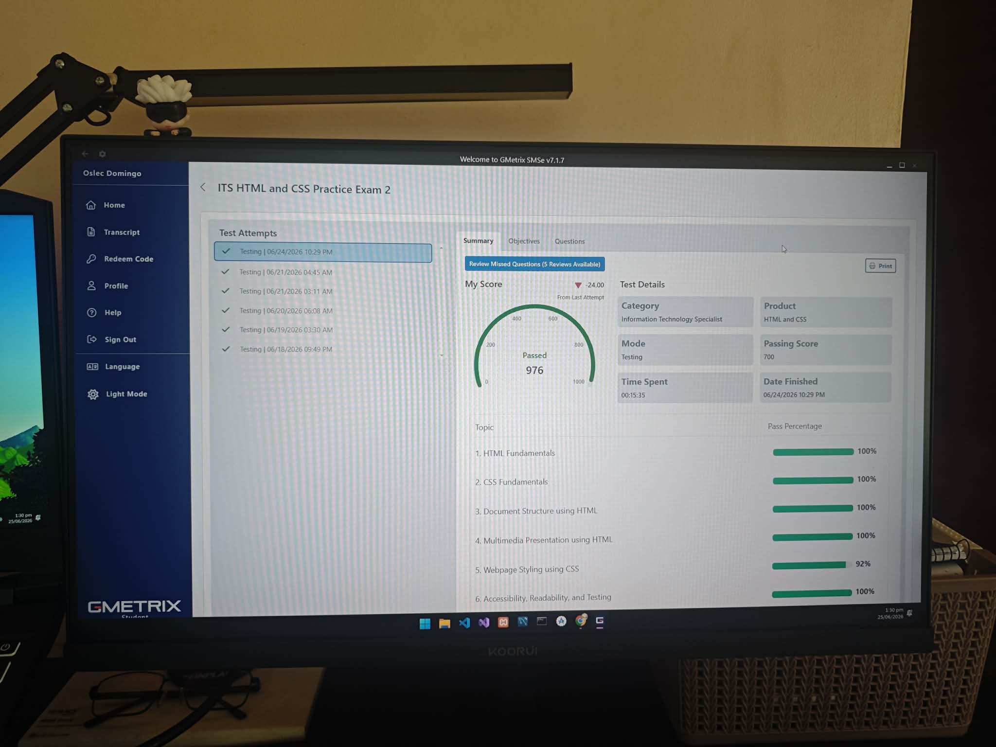
Today, I focused my review session on the objectives of the IT Specialist HTML and CSS certification exam. Instead of coding without a plan, I organized my study around the main topics covered by the exam.
This approach helped me identify which concepts I already understood and which areas still needed more practice. My review covered HTML document structure, semantic elements, forms, CSS styling, positioning, responsive design, accessibility, and testing.
Reviewing HTML Fundamentals
I started with the basic structure of an HTML document. A properly organized webpage normally includes the <!DOCTYPE html> declaration, followed by the <html>, <head>, and <body> elements.
The <!DOCTYPE html> declaration tells the browser that the document uses HTML5. Inside the <head>, I reviewed important information such as the page title, character encoding, viewport settings, stylesheets, and meta descriptions.
The visible content of the webpage is placed inside the <body> element.
I also reviewed how HTML elements are opened, nested, and closed correctly. Most HTML elements use opening and closing tags, but void elements such as <img>, <input>, <br>, and <meta> do not require closing tags.
Understanding these rules is important because incorrect nesting or missing tags can affect the structure and appearance of a webpage.
Understanding Semantic HTML
One of the most important parts of my review was semantic HTML. Semantic elements describe the purpose of the content they contain.
Some of the elements I reviewed included:
<header>for introductory content<nav>for navigation links<main>for the primary content<article>for independent content such as a blog post<section>for grouping related content<aside>for supporting or secondary information<footer>for information at the bottom of a page
Before learning semantic HTML, I often thought that using <div> elements for everything was enough. Although <div> is useful for grouping elements, semantic elements make the structure easier for developers, browsers, search engines, and assistive technologies to understand.
I also practiced examining nested elements. Block-level elements generally begin on a new line and take up the available width, while inline elements remain within the flow of surrounding text. Modern CSS can change how an element is displayed, but understanding its default behavior is still useful.
Practicing Tables and Forms
I reviewed the correct structure of HTML tables using elements such as <table>, <tr>, <th>, and <td>.
The <tr> element creates a table row, <th> identifies a header cell, and <td> contains regular table data. Tables should be used for actual tabular information instead of controlling the layout of an entire webpage.
Forms were another important part of my study session. I practiced using form controls such as text fields, number inputs, radio buttons, checkboxes, selection lists, and submit buttons.
I paid special attention to attributes such as:
action, which identifies where the form data will be sentmethod, which determines how the data will be submittedrequired, which prevents an empty field from being submittedminandmax, which restrict acceptable numerical valuesplaceholder, which provides a short hint inside an inputtype, which determines the kind of input being created
I also reviewed the importance of connecting a <label> to its input. Labels improve usability and help visitors who use screen readers.
Strengthening My CSS Knowledge
The second half of my study session focused on CSS fundamentals and webpage styling.
I reviewed the three common ways to add CSS to a webpage: inline, internal, and external CSS. External stylesheets are generally easier to maintain because one CSS file can control the appearance of multiple pages.
I also practiced the CSS cascade and selector specificity. I reminded myself that stylesheet location and selector specificity are related parts of determining which rule wins, but they are not exactly the same thing.
A more specific selector will often override a less specific selector. However, importance, source order, and where a rule comes from can also affect the final style applied by the browser.
Reviewing the CSS Box Model
The box model was one of the areas that required careful attention. Every element can be understood as a box made of four parts:
- Content
- Padding
- Border
- Margin
The content is the actual text or image. Padding creates space inside the element around its content. The border surrounds the content and padding, while the margin creates space outside the element.
I practiced calculating the total size of an element when its width, padding, and border were provided. I also reviewed box-sizing: border-box, which includes the padding and border inside the declared width and height.
Understanding the box model helps me solve problems involving unexpected spacing, overflowing elements, and incorrect layouts.
Comparing CSS Positioning Properties
CSS positioning can be confusing, so I reviewed how the main position values behave:
staticis the default position of most elements.relativekeeps an element in the normal document flow but allows it to be moved from its original position.absoluteremoves an element from the normal flow and positions it relative to its nearest positioned ancestor.fixedremoves an element from the normal flow and keeps it positioned relative to the browser window.stickybehaves like a normal element until a scrolling position is reached.
Comparing these properties helped me understand why an element sometimes overlaps other content or moves differently from what I expect.
Responsive Design and Viewport Units
I also reviewed responsive web design. A responsive webpage should remain readable and usable on desktop computers, tablets, and mobile phones.
Media queries allow CSS rules to be applied when the screen meets a particular condition. I also practiced using relative units such as percentages, rem, vw, and vh.
The vw unit is based on the width of the browser viewport, while vh is based on its height. These units can be helpful, but they must be used carefully to avoid creating text or sections that become too large or too small.
Accessibility, Readability, and Testing
I dedicated the final part of my review to accessibility, readability, and testing.
I reviewed the importance of adding meaningful alt text to informative images. Alternative text helps people using screen readers understand the purpose of an image. Decorative images may use an empty alt attribute when they do not provide important information.
I also checked the importance of:
- Using headings in a logical order
- Providing labels for form controls
- Maintaining readable color contrast
- Writing meaningful link text
- Making pages usable with a keyboard
- Using semantic HTML
- Checking for broken links and syntax errors
A webpage should not only look attractive. It should also be understandable and usable by different visitors.
What I Learned from This Review
Breaking my study session into specific topics made the certification objectives feel less intimidating. It showed me that HTML and CSS are not only about memorizing tags and properties. I also need to understand why a particular element or style should be used.
My strongest areas are basic document structure and common styling rules. However, I still want to practice selector specificity, the box model, positioning, forms, responsive layouts, and accessibility.
The best way for me to improve is to combine reviewing with actual coding. Reading a definition helps, but creating a webpage and fixing its errors gives me a better understanding of how the concept works.
Conclusion
This study session helped me strengthen my knowledge of HTML and CSS while preparing for the IT Specialist certification exam. I reviewed webpage structure, semantic elements, tables, forms, the CSS cascade, the box model, positioning, responsive design, and accessibility.
I still have more topics to practice, but I feel more confident than before. Every review session and coding activity brings me one step closer to improving my web development skills and reaching the top.
Pingback: Welcome to My IT Student Learning Journey - domingocelso.site